America has gotten more and more politically polarized over the years. This polarization is reflected in several states voting consistently red or blue in the presidential elections year after year. This analysis investigates several red-blue stereotypes popular in the media and measures how well they align with the actual voting patterns.
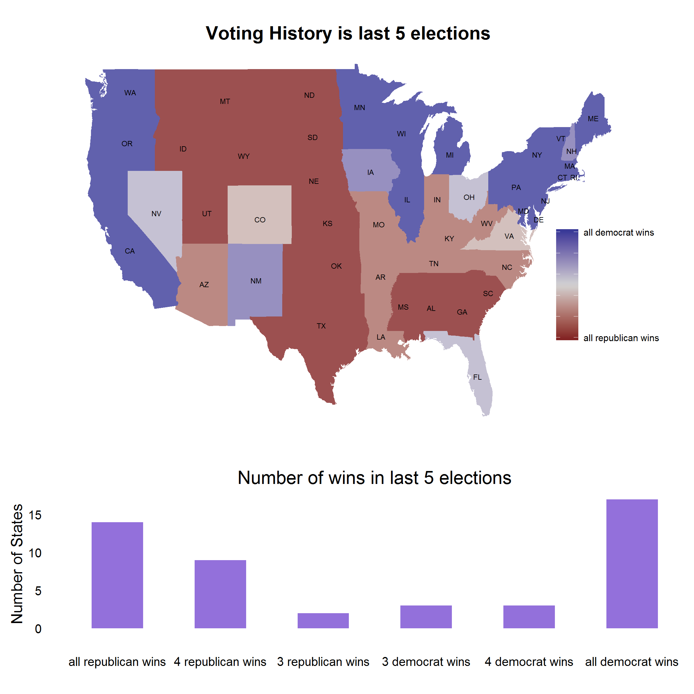
The plot below shows the summary of last five presidential elections. 42% of states have voted democrat in 4 or more elections, while 48% of states have voted republican in 4 or more elections. The bimodal nature of the graph is a stark reminder of the increasing schism in the country in political preference (click image to see it in higher res).
Methodology
In the sections that follow, I pick a stereotype that we suspect of red/blue biases and try to come up with an objective measure how well the bias aligns with the voting history of the state.
In each section, the state choropleth plot simply shows the leanings of each state colored linearly on a min-max scale. The vote differential table compares the voting history of each state with color rating of the state for that topic. The color rating of the state for that topic is derived by ranking the states and then made to fit the same distribution as the voting history (eg if there are 17 states that voted completely blue, then there would be same number of states in that exact shade for the topic distribution as well). For this reason, the shades in the choropeth might not always be same as the one in Vote Differential table.
The schismometer reading is calculated by summing the absolute differences between the Voting History and the topic ranking from the vote differential table and then normalized. A reading of 100 indicates complete alignment between voting and topic bias, while a rating of 0 indicates no alignment at all (meaning that topic bias colors for states line up completely randomly with their voting history).
This analysis only looks at the lower 48 states and doesn’t account for Alaska and Hawaii.
Household income in red states is lower than blue states
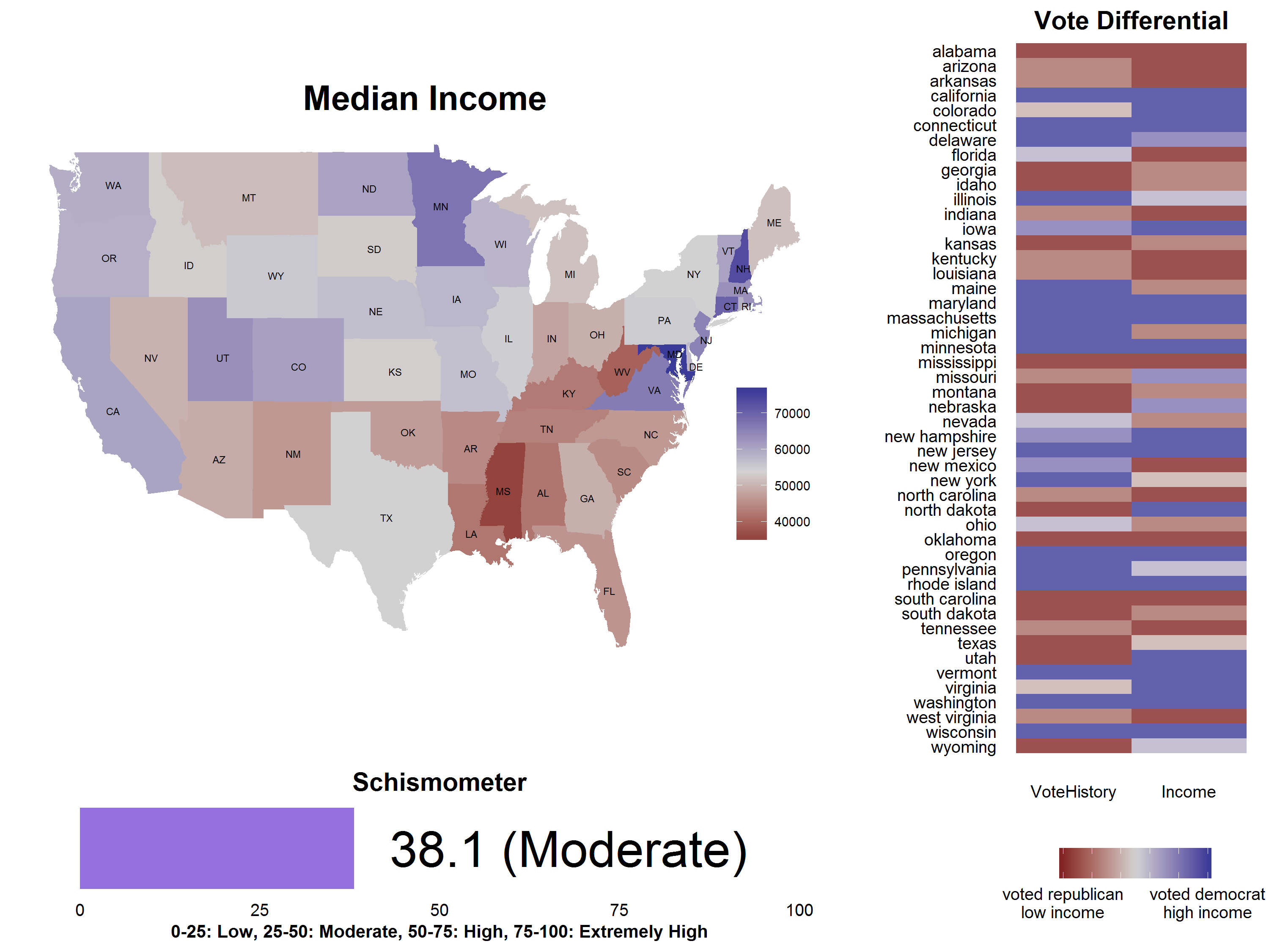
There is a perception that red states tend to be rural and poorer compared to blue states. 97 of the nation’s 100 poorest counties are in red states. However, comparing the median household income with voting history shows that schism to be only moderate. The nationwide state median income is about 54K. There are a fair number of states that buck the trend pushing the number lower.
- Utah and North Dakota are decidedly red, but have a fairly high median income at 63K and 60K compared to national average.
- New Mexico, Maine and Michigan have voted blue, but have relatively low household income at 47K, 51K and 52K.
There are more hate groups in red states than blue states
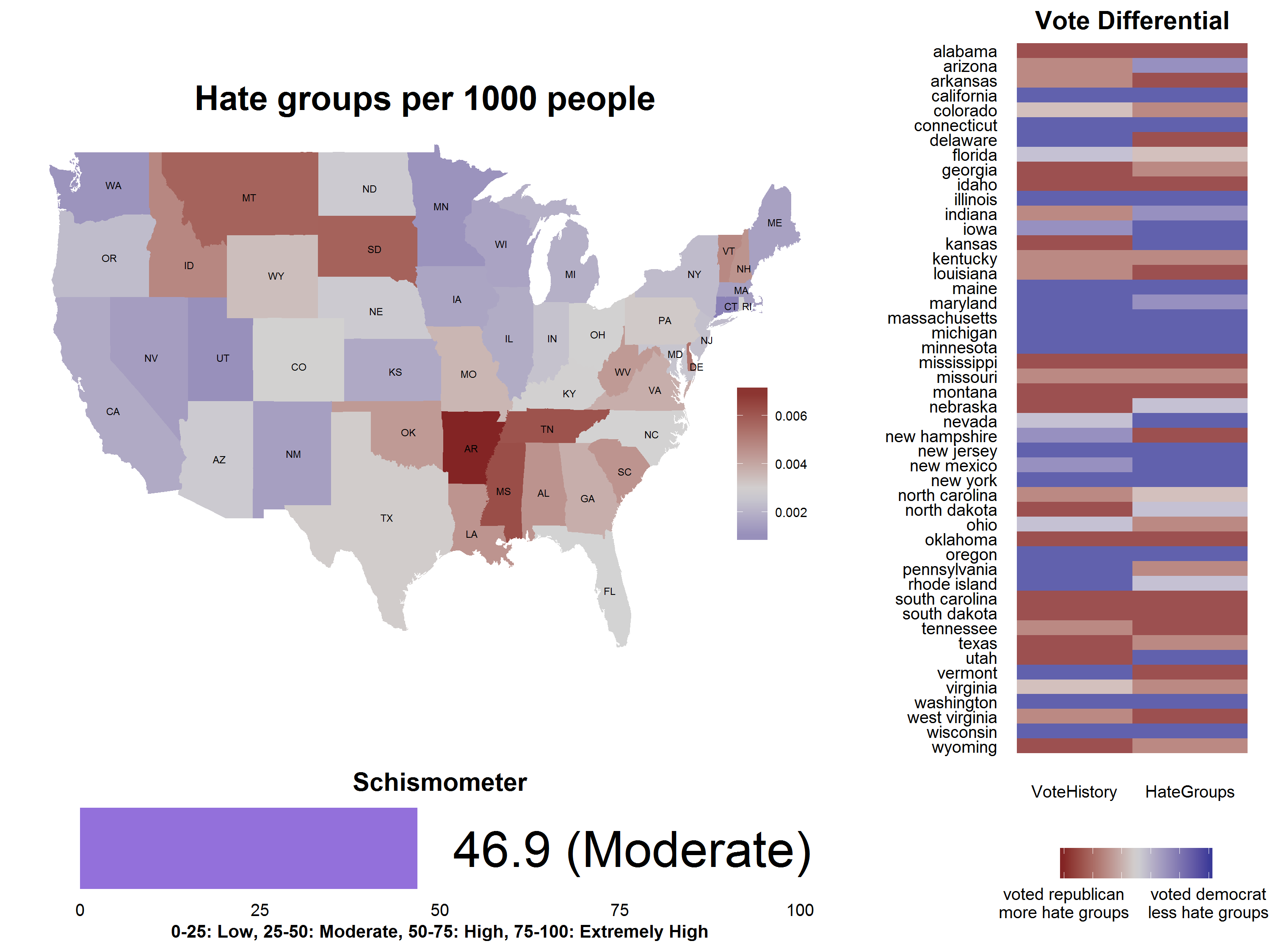
The Southern Poverty Law Center tracks the various hate groups operating in the country. Generally, liberals accuse conservatives of hate-mongering, while conservatives accuse liberals of being pacifists. Lets see if the stereotype holds up by comparing the hate groups per capita with the voting history.
Overall, there seems to be a pretty good alignment between the state’s voting history and number of hate groups operating there. Mean hategroup rate in the country is 0.003 per 1000 people. Here are the outliers that go against this stereotype.
- Utah and Kansas have been decidedly red for a long time, but have relatively low hate group rate at 0.001 and 0.0017.
- Delaware and Vermont are democrat states, but have a high hate group rate at 0.005 and 0.0047.
There are more abortion facilities in blue states
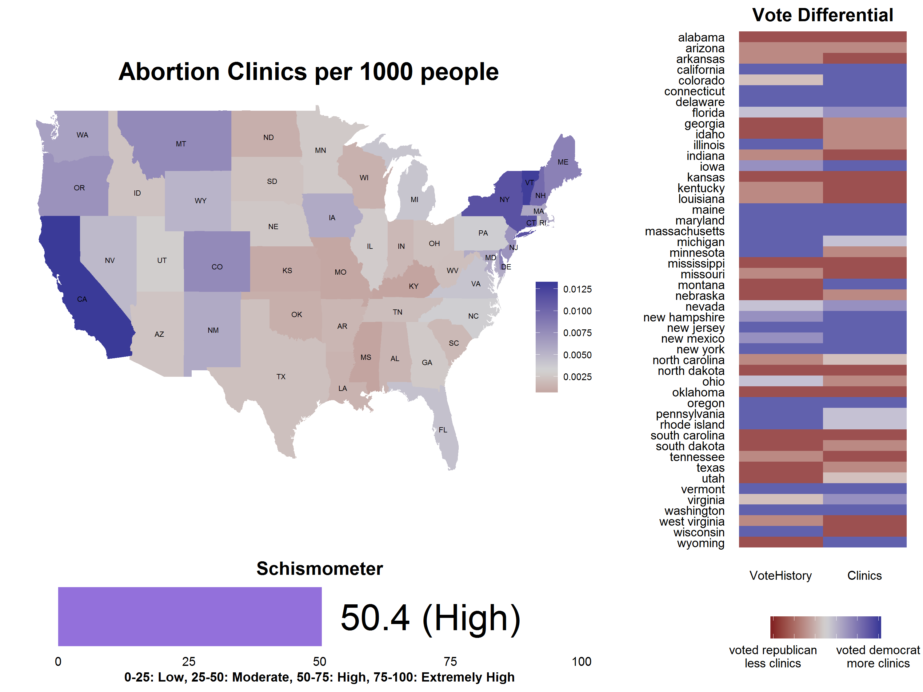
This should be an easy one. Abortion rights have divided the country for over fifty years now and the red states have been known for restricting access to abortion facilities in those states. The abortion stats were gathered from the abort73 site. And as expected, the country shows a very clear divide when it comes to abortion clinics. There are about .0045 abortion facilities per 1000 people. As always, few states go against the voting trend to pull the rating down a bit.
- Wyoming and Montana have voted red consistently, but have a substantially high access to clinics at 0.0077 and .005.
- Wisconsin has voted democrat in last five presidential elections, but still has fairly low number of clinics at 0.001 clinics per 1000 people.
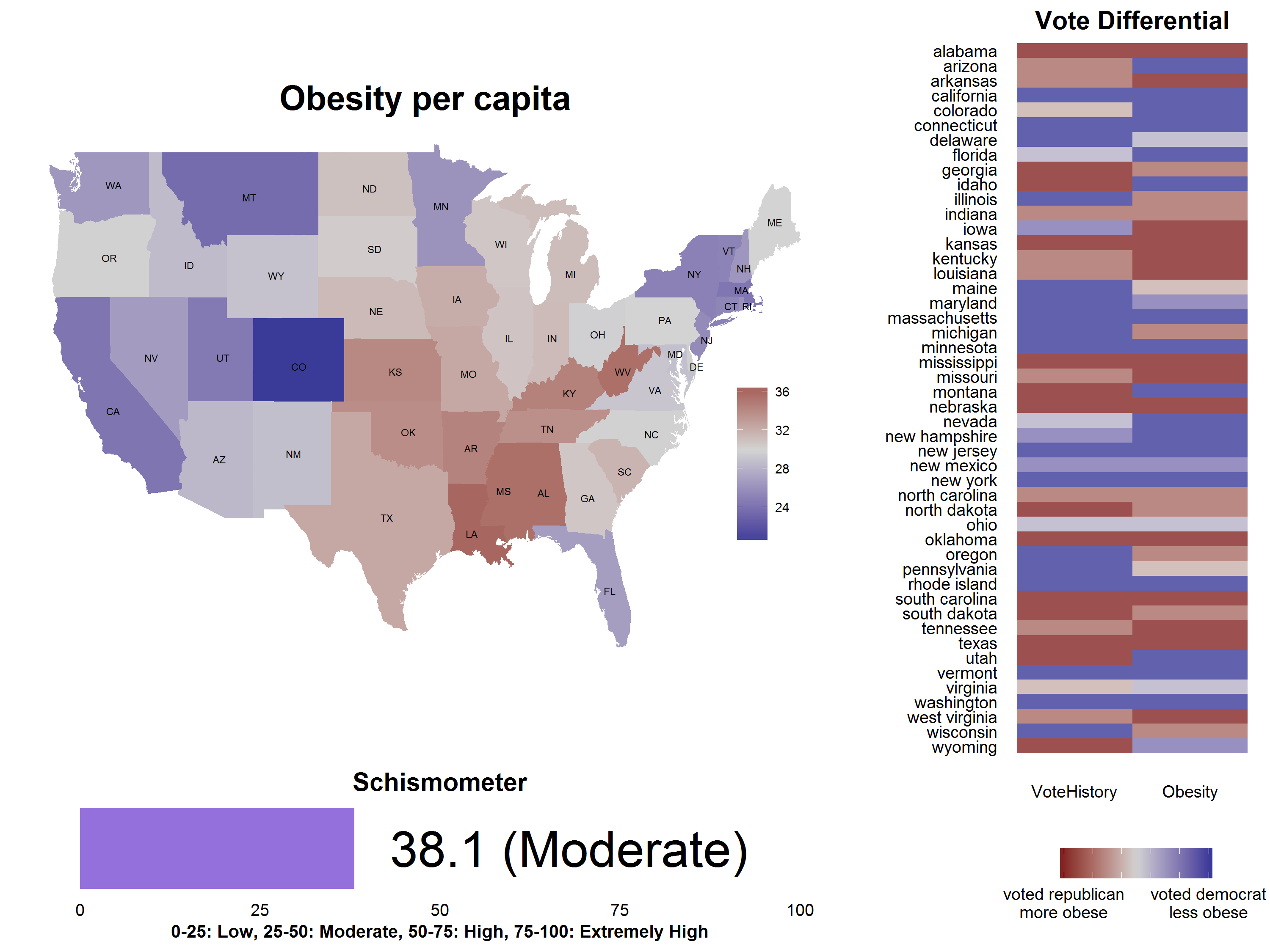
Obesity is more prevalent in red states
This was more of a hunch coming from the fact that obesity and poverty are closely related. However, just like median household income, this schism turned out to be only moderately aligned to voting. In fact, the schismometer rating was exactly the same for median income and obesity. The median state obesity is about 30%.
- Utah, Montana and Idaho are decidedly red states, but have relatively low obesity at 24.5%, 23.6% and 28.6%.
- Wisconsin, Illinois, Iowa, Michigan and Oregon are blue states, but have slightly above average obesity at 30.7%, 30.8%, 32.1%, 31.2% and 30.1%.
Red States prefer beer, while blue states prefer wine
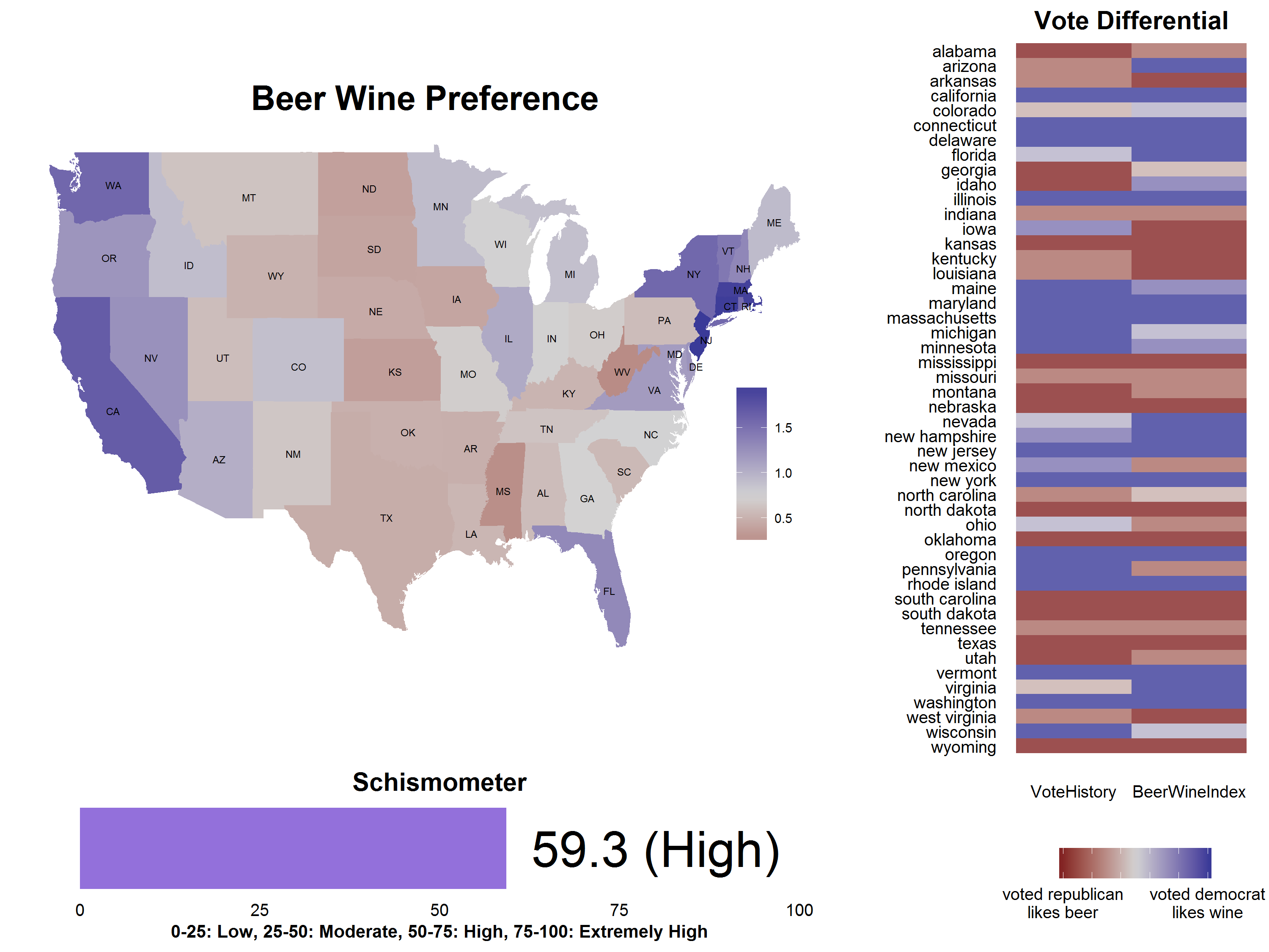
This hunch came to me when I did my earlier analysis, where I compared the relative beer and wine sales in the various states. The preference for beer and wine seemed to divided along party lines and this analysis shows this to true with the schism being the sharpest compared to all the other topics.
- Arizona is a slightly red state, but tends to prefer wine slightly over beer.
- Idaho has voted red 4 out of last 5 elections and it does prefer beer, but the preference is not as strong as the other hardcore beer loving states like Mississippi.
- Pennsylvania and Iowa are both relatively blue states, but decidedly prefer beer over wine.
Conclusion
To be honest, the schismometer rating is somewhat arbitrary and its hard to know what “high” or “moderate” schism means in a real sense. The states are divided into six unequal segments depending on their voting history as shown in the first figure histogram. Mathematically, to be in the “high schism” zone, at most 25 states can break their distribution by jumping at most 1 segment. This is a fairly high bar, which causes most topics to get pushed to the moderate zone.
Another reason for a lot of topics moving towards moderate zone is that liberals themselves seem to be divided into two groups. States like California, Washington, New York seem to be more traditionally liberal, while States like Pennsylvania, Michigan, Illinois are liberal in a more “blue collar” sense. The latter states seem to have a lot of red tendencies. In the same way, Utah has been traditionally red, but consistently breaks the red stereotypes. In all, other than preference for beer or wine, most of the stereotypes about red and blue states seems to be only moderately true.
All data and code for this analysis is available here.